
Design Manager @ Comcast

The cable television landscape was drastically changing in 2019.

A major trend that we saw within cable television was cord-cutting. 2017 concluded with 24.9 million adults that cancelled a traditional pay-TV service and did not re-subscribe, by 2018 that number had grown to 33 million nearly a 33% increase.
The driving factor? Cost. Consumers were realizing they could subscribe to Netflix, Amazon Prime, Hulu and the total would be considerably less than your average monthly cable bill of $107.
This created an interesting space for content aggregation and discovery. The question then became…
How might we bring premium X1 features to a cord-cutting customer base in order to serve them the best platform to find and discover all of their entertainment needs?
Through research into viewer’s browsing habits we were able to formulate a viewpoint on what to prioritize on initial screen load.
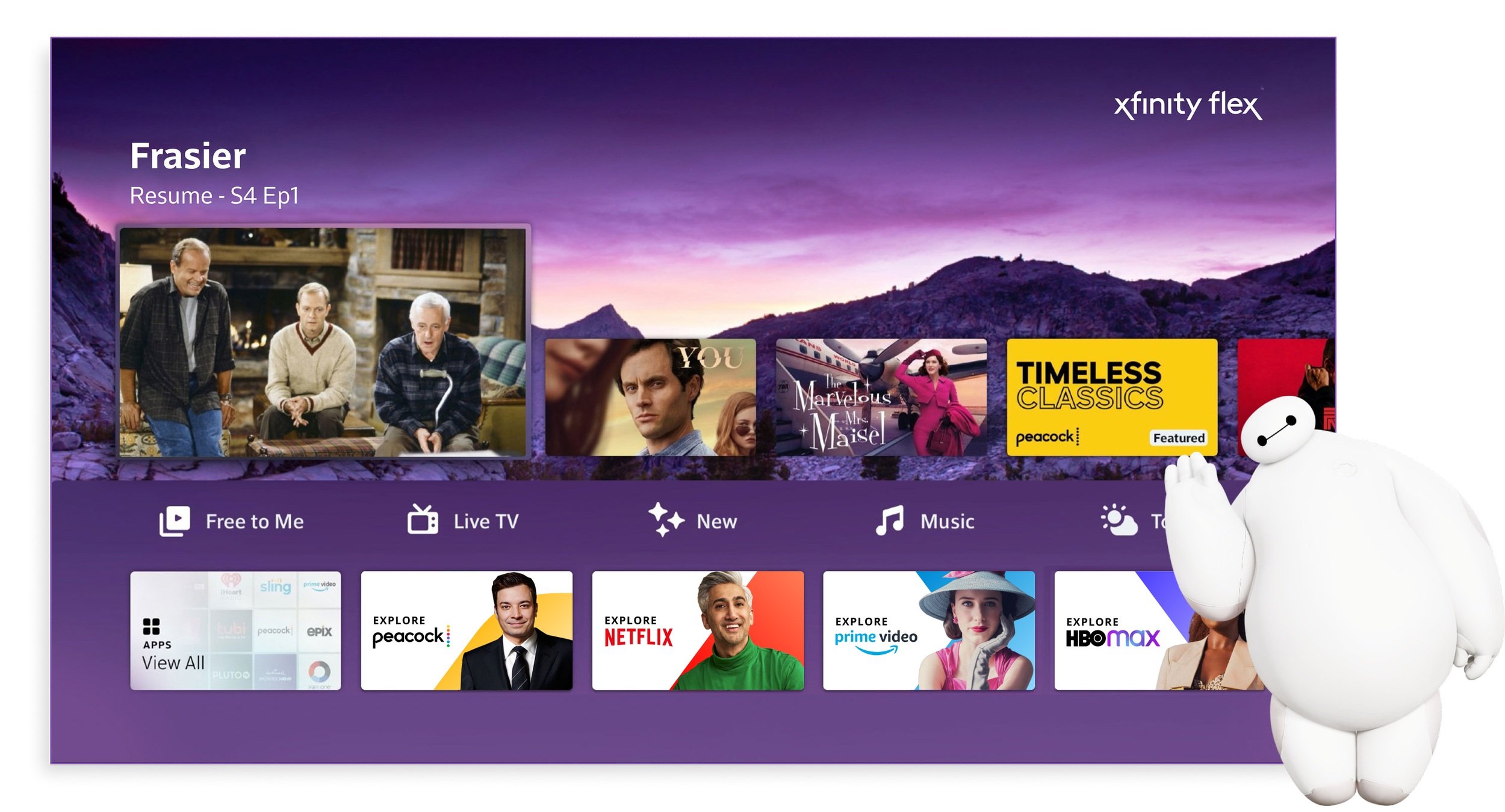
Watch History
You’re always greeted with a resume point to instantly start watching whatever piece of content you had viewed last. To the right is a history of content you’ve watched, and apps you’ve launched.
Navigation Chips
Provide different categories or ways to watch. In the current day iteration these chips are replaced with an apps row, due to the increasing amount of time users are spending in different stream apps.
Editorialized Content
Collections and curated playlists built by the editorial team, what was trending, what was popular on each of the major streaming services.

A New Approach to Navigation & Content
Most users coming back to Flex would resume watching their previous content or search for a specific title.
This presented a huge opportunity in the form of content discovery. We collaborated with the editorial team to figure out what types of content should take priority.
Free Content
Never paywall a customer. We should only present and recommend content from services they’ve signed into.Trending
No one wants to miss out on the show that’s been trending on twitter, that your friends binge watched over the weekend.Personalization
Start to recommend titles based around their watch history and editorial collections based on their likes.
Brand Refresh

A new platform for a younger demographic that are more tech savvy than current X1 customers presented us with the opportunity to update the visual language for Flex to something that felt younger, more fun and slightly casual.
I worked alongside the brand design team to establish a visual toolkit that could be used to extend the new look and feel to all the different parts of Flex. We incorporated the X mark through zoomed-in crops of the angles and rounded corners.
The color palette was also massively expanded. Previously on X1 the visuals were very dark, with limited color. We started to pull colors in from the Comcast NBC Universal logo, providing fresh new colors to use that were also represented by our overall brand.


Brand Weight
The elements of our brand toolkit - the expressive X, dynamic angles, extended color palette, and complimentary font treatments - all come together to create a distinct Xfinity experience.
Campaigns that have both high business priority and carry the most customer impact should always use the heaviest brand weight to reinforce the Comcast Xfinityexperience.
We want to give the opportunity to designers to break free of the standard elements and make something unique. We call this our companion branding, reserving it for campaigns with partners, highlighting other brands, or targeting specific demographics.


Light Brand Weight | Heavy Brand Weight
Brand weight directly relates to overall offerings which make a campaign unique to Xfinity. Not all artwork on our platform requires Xfinity branding. Being selective with usage helps top campaigns stand out.