
Free People
Art Director @ Free People
Design direction and production. Branded experience. Mobile & web design.
Free People is an American bohemian style brand that has a target demographic of women in their early to mid-twenties. This group of consumers are extremely phone-savvy and would be shopping while on the go rather than sitting at a desktop. The goal of this project was to rebuild the Free People website with the philosophy of mobile first. We also needed to find ways to optimize the site and allow for quick load times regardless of data connection speeds.
Goals:
Image compression to increase page performance
Enrich the product purchasing experience
Provide a quick and efficient add to bag experience
Optimized and fast check out process
Results:
66% faster page load speeds.
50% page size reduction.
Conversion rate outpaced week-over-week rate within first week
50% increased traffic to product pages


One shared repository
My contributions to this project were to lead the redesign of the Free People website, along with development of the front-end HTML and CSS. The project was nicknamed “Replatform” because the codebase that would be used for Free People, would then be shared to the other URBN brands, Urban Outfitters, Anthropologie, and BHLDN. The end goal being a shared codebase between the 4 different brands, and a shared check-out experience similar to how Gap at the time handled their family of brands.
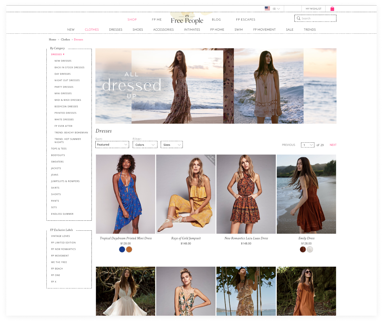
Just Browsing
Initially the product browse page would sometimes take 20+ seconds to fully load on an enterprise speed internet connection. As we started to dig into possible reasons why, I was able to see that the imagery being loaded was unoptimized for web and often times uncompressed.
My solve was to work with both the design production and dev teams. For design we incorporated new tools into their workflow as well as teaching the team about how to save images for web vs for print design. Instantly we saw images that would be 2MB compressing down to < 400kbs. Netting us an absolutely massive 80% reduction in file size.
With the dev team we worked to cap the amount of product shown at once on the browse pages to 24 and incorporated lazy loading onto the page. Everything on screen would be priority loaded, with the remaining content loaded after to ensure that customers didn’t have any weird gaps of content on the page.

Capturing the moment
A metric that every e-commerce website measures is conversion rates alongside how long a customer will browse a product until they add it to cart. On desktop we wanted the ability to quickly browse a specific product without having to load the entire product detail page.
The quickshop modal aimed to allow customers to quickly pick a color, size and instantly add it to their cart. This alleviated the need to load other content that could turn away a potential customer. What we measured was a considerably faster product load time in a modal vs the product detail page, often times up to 33% faster.


Instantaneous Details
If a customer dove deeper onto the product detail page then we want to provide the most seamless, quick experience possible for her to see all the various thumbnails and different color choices.
Working with the dev team, we queued the initial color choice to be the priority load, followed by the imagery for the subsequent color swatches. The reviews, the FPMe social imagery fell well below the fold of the page so we knew they could be a lower priority, and we wanted to ensure that if the customer were to look at different option it would instantly be ready to browse.
I worked alongside the print team, and the development team to ensure that the imagery that was being loaded would be lean and efficient for data connections, anywhere. We saw average reductions of at least 45% in overall imagery data compared to before compression workflows and optimization automations.